Based UI
Design System
Digital Design
Product Manager
Based UI is a developer oriented design system featuring 100+ components, WCGA supported color system, Figma variables and Token Studio integration, theming and .JSON syncing.
I’ve designed it from scratch, implemented it together with 3 front-end developers and continuously improve it in the past 2 years.
Challenge
At Saulx we love to build functional products fast. That’s how we learn about our products and customer needs. Move away from assumptions and hypotheses.
But after building the same UI in different products a couple of times, I figured that it would save us quite some time to not constantly re-invite the wheel. A radio button is a radio button is a radio button. The need for our own component library was born.
I aimed for something proprietary, tailored to our unique use-cases, and entirely within our control. This way, when issues arise, we can be certain that we can resolve them.
Solutions
The primary target group of the component library is our developers. If it doesn’t work for them, the library is useless. That’s why I made sure to involve them in the process as much as possible.
I started out with the underlying fundamentals of a component library; the color system and typography. With the use of design tokens (Figma variables) I’ve established a system demands minimal effort to implement yet powers high customisation without the need for a developer to apply changes.
When the fundamentals were in place I proceeded to design the components themselves. Following the widely recognised atomic design principle, I started with designing the smallest components and progressively moved towards more complex templates and pages. During this phase, I also led a team of three front-end developers responsible for implementing my designs.
Results
The end result is a fully functional component library featuring 100+ components. This library is actively used in our to primary products, Based and Tally. It enables our developers to swiftly create new features prototypes without needing design intervention. This, however, doesn’t imply that design is sidelined. Design is instrumental in adding the finishing touches and fine-tuning the high level UX.
Dark mode
-
![]()
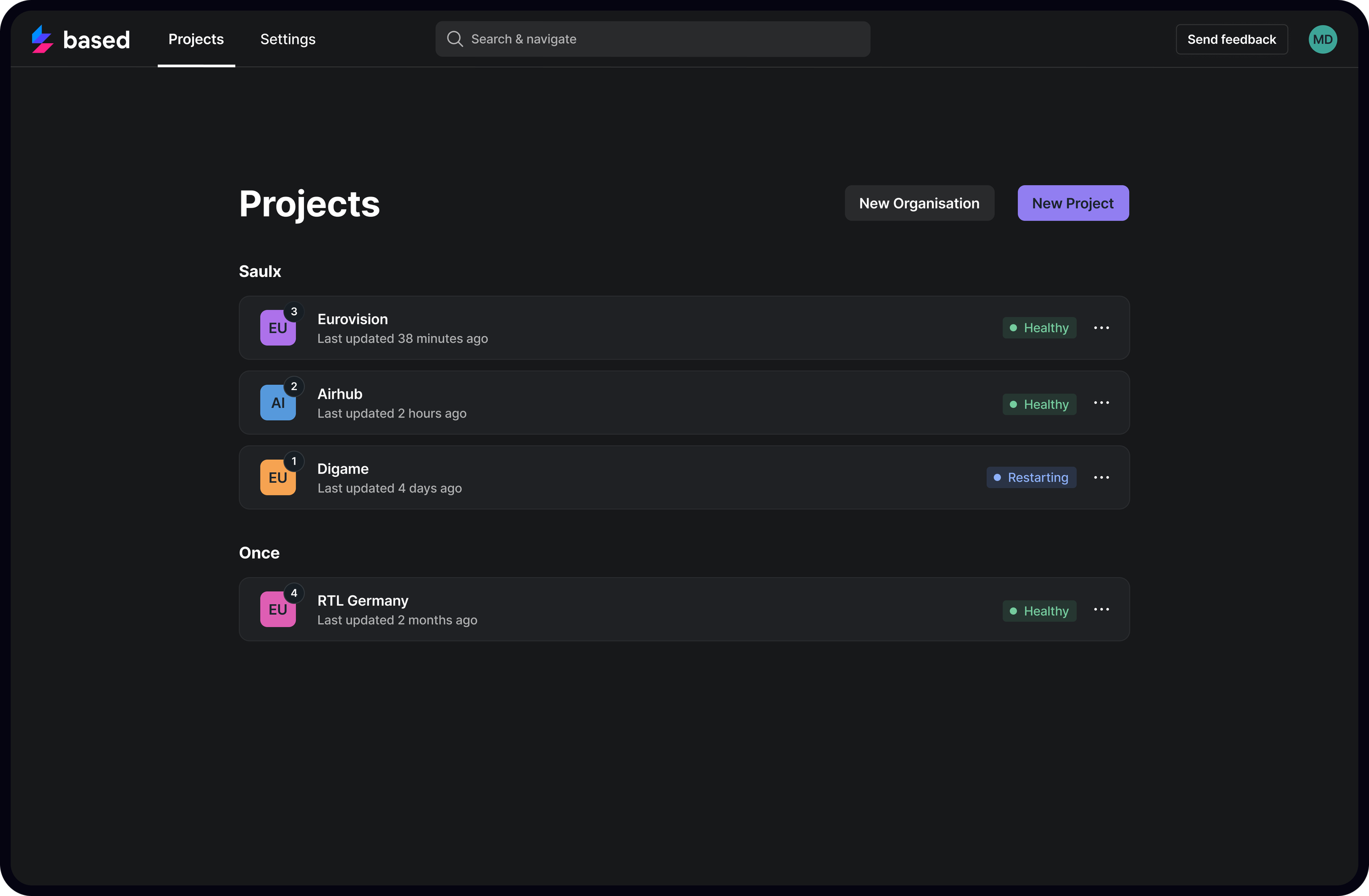
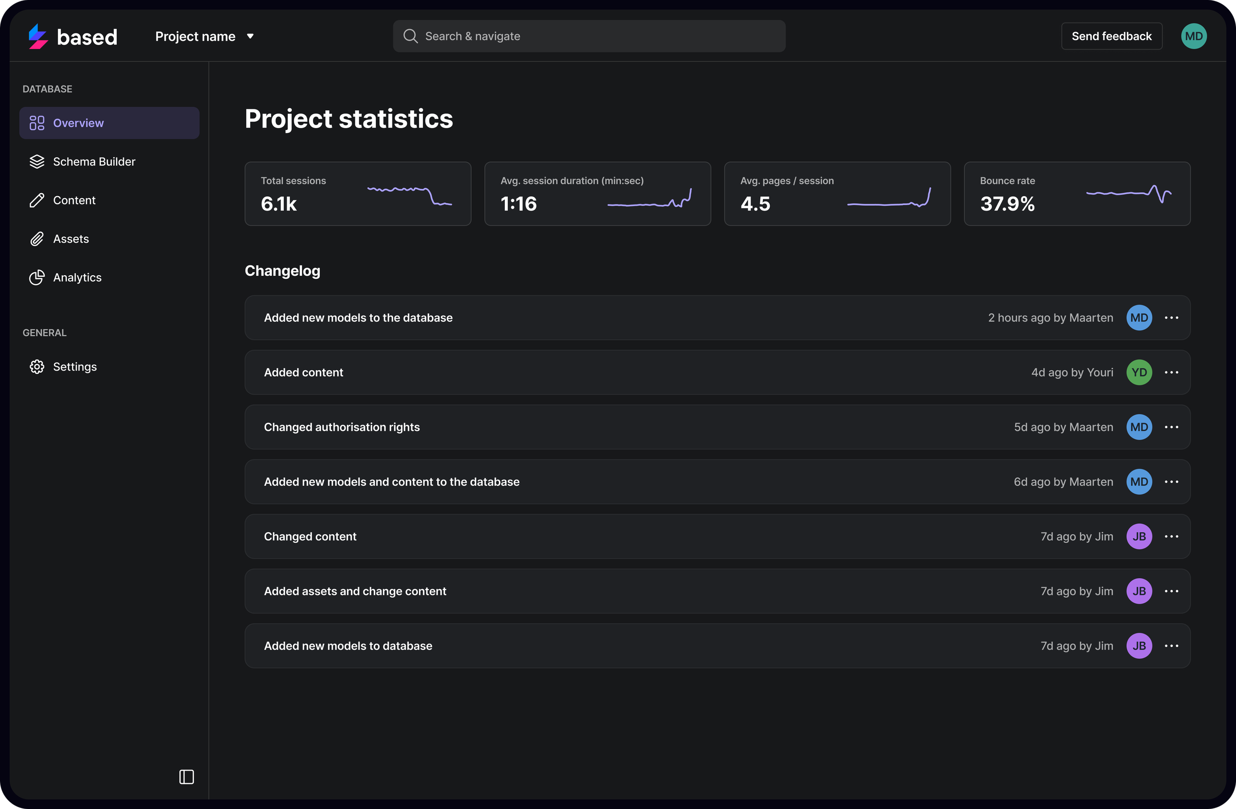
Project Overview
-
![]()
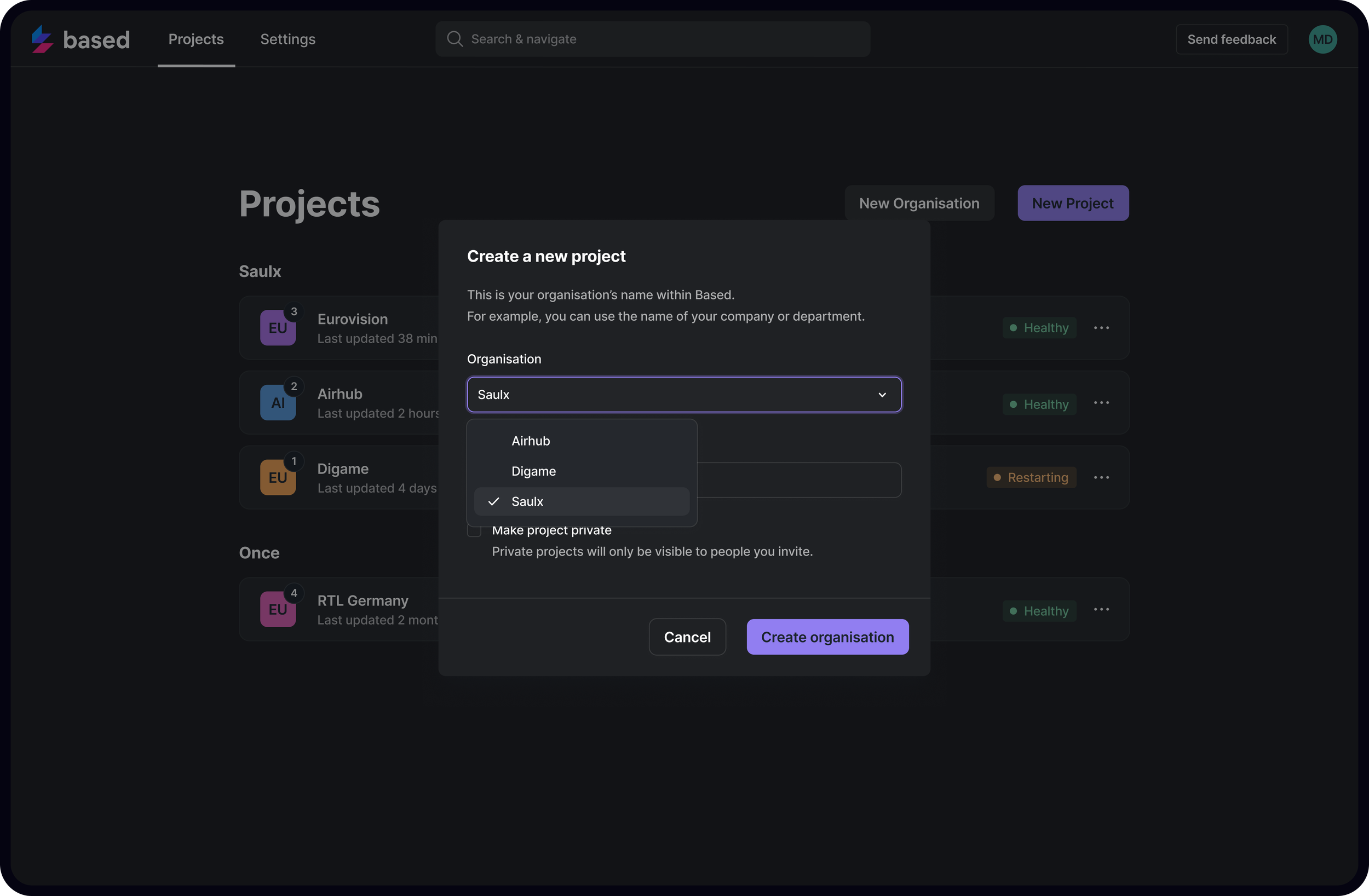
Modal Example
-
![]()
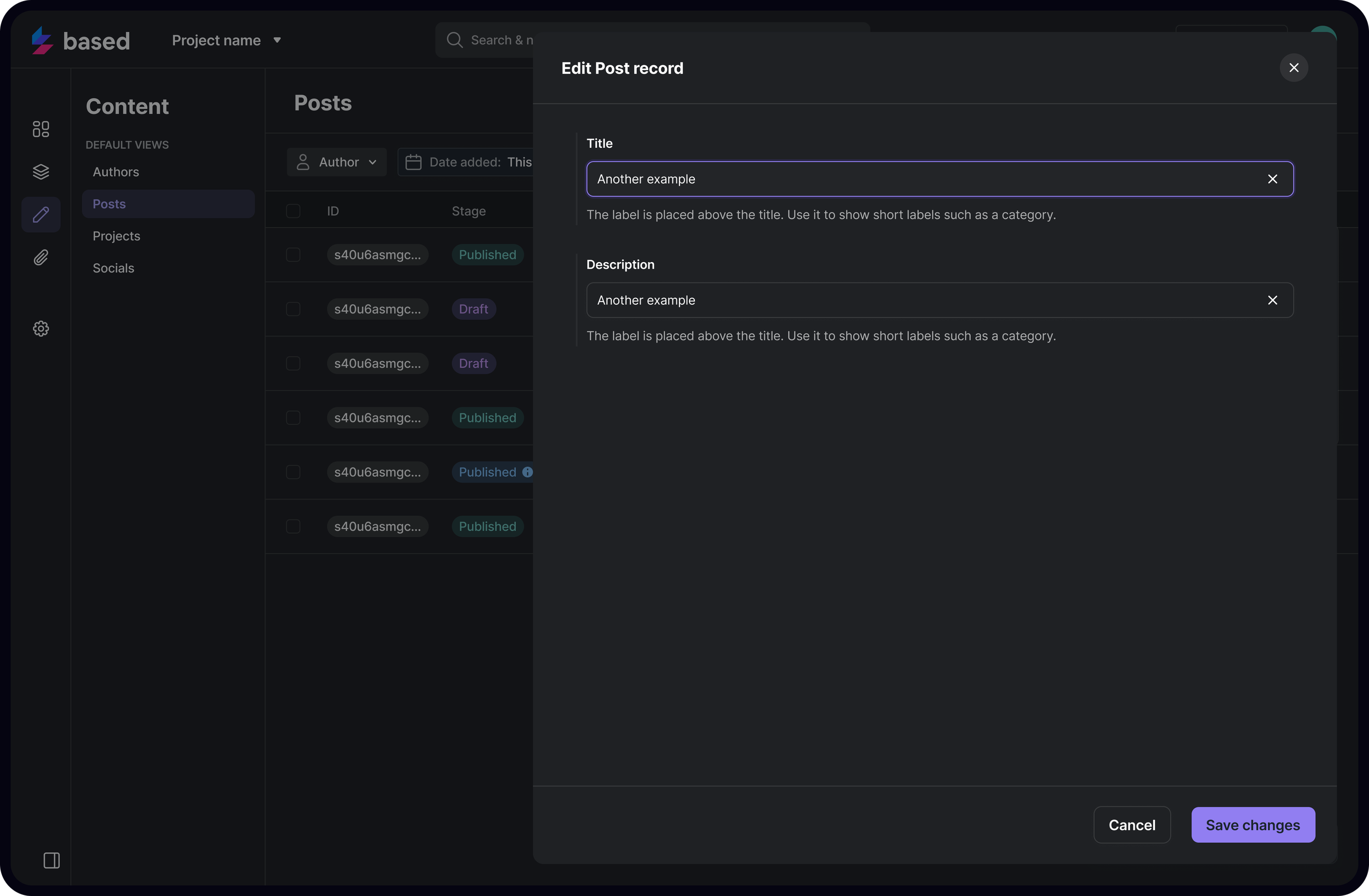
Content Editor
-
![]()
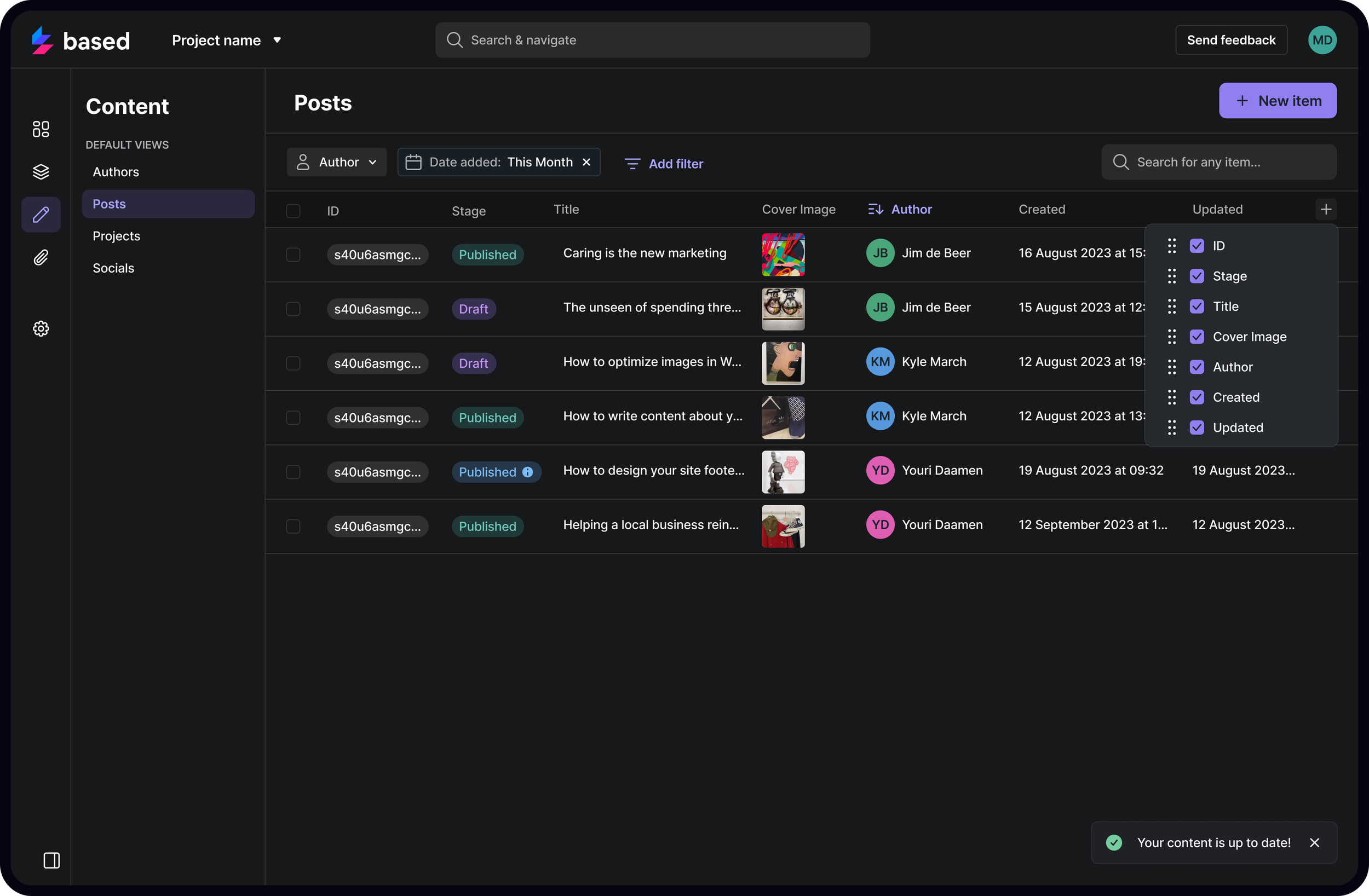
Editable Table
-
![]()
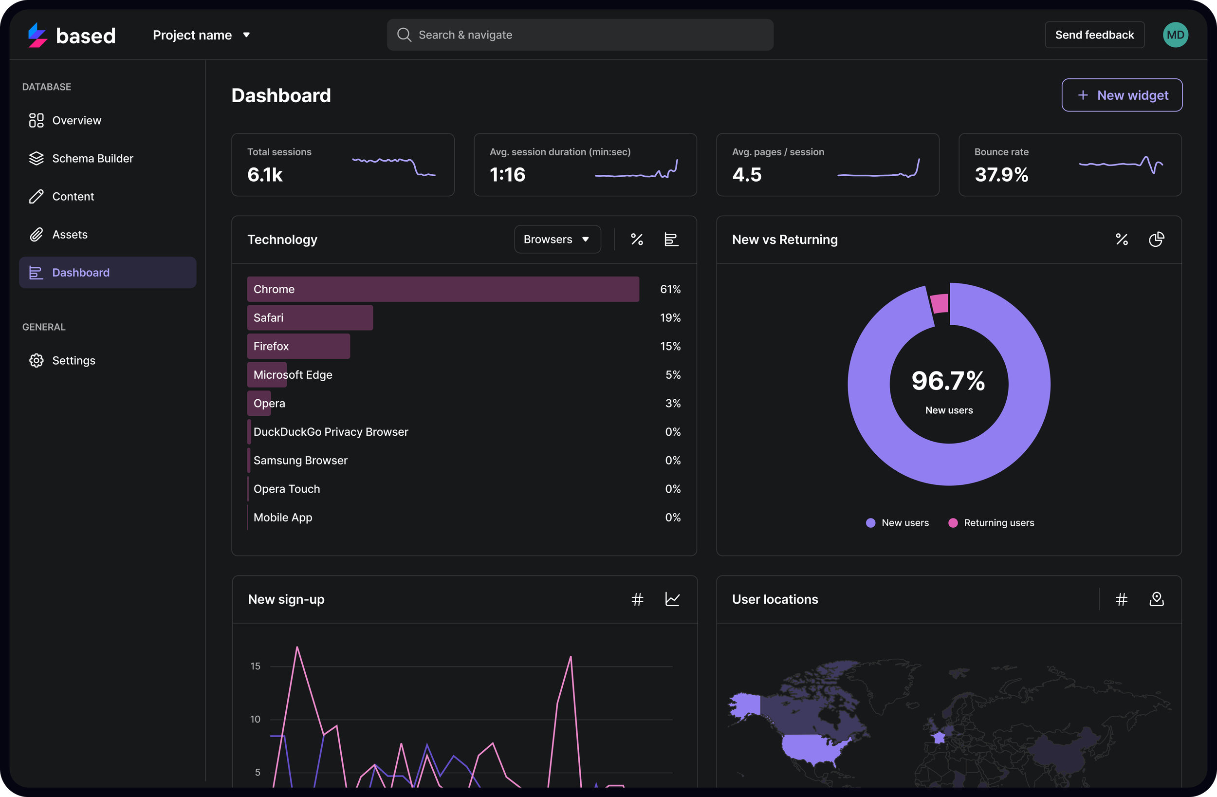
Logging and Stats
-
![]()
Analytics
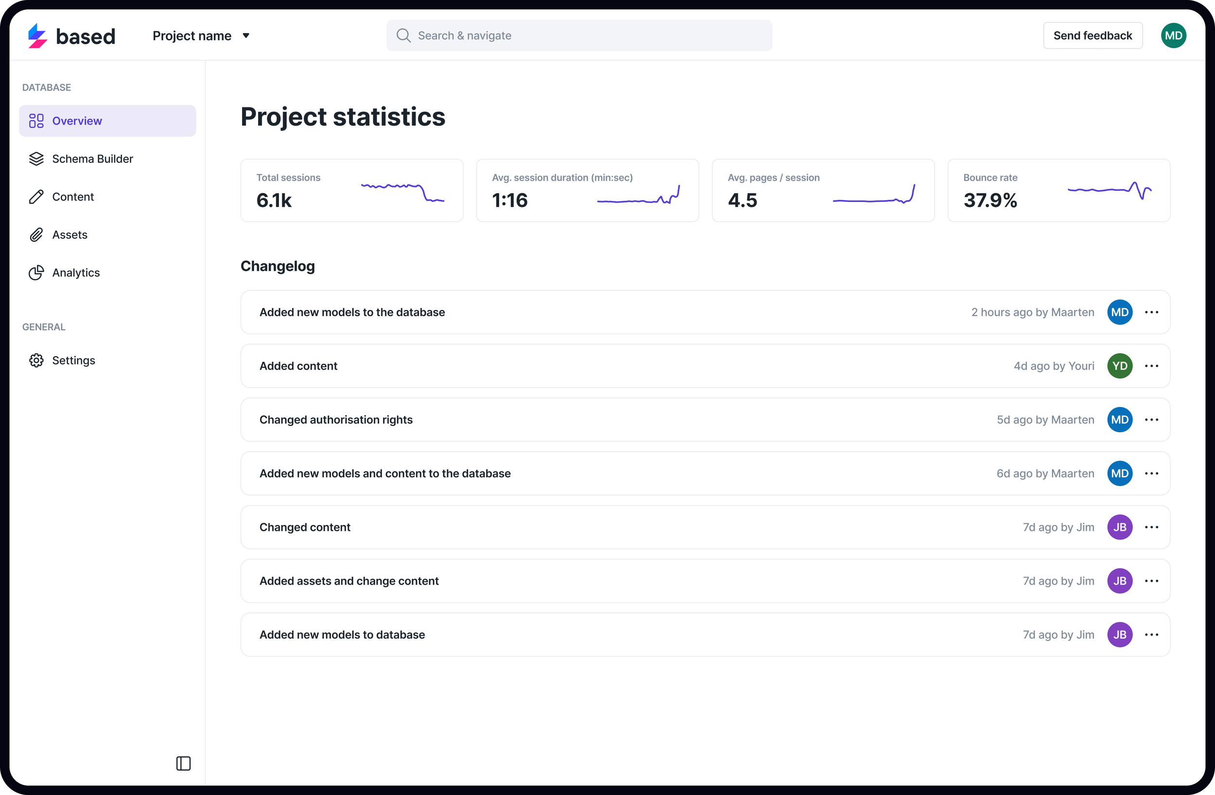
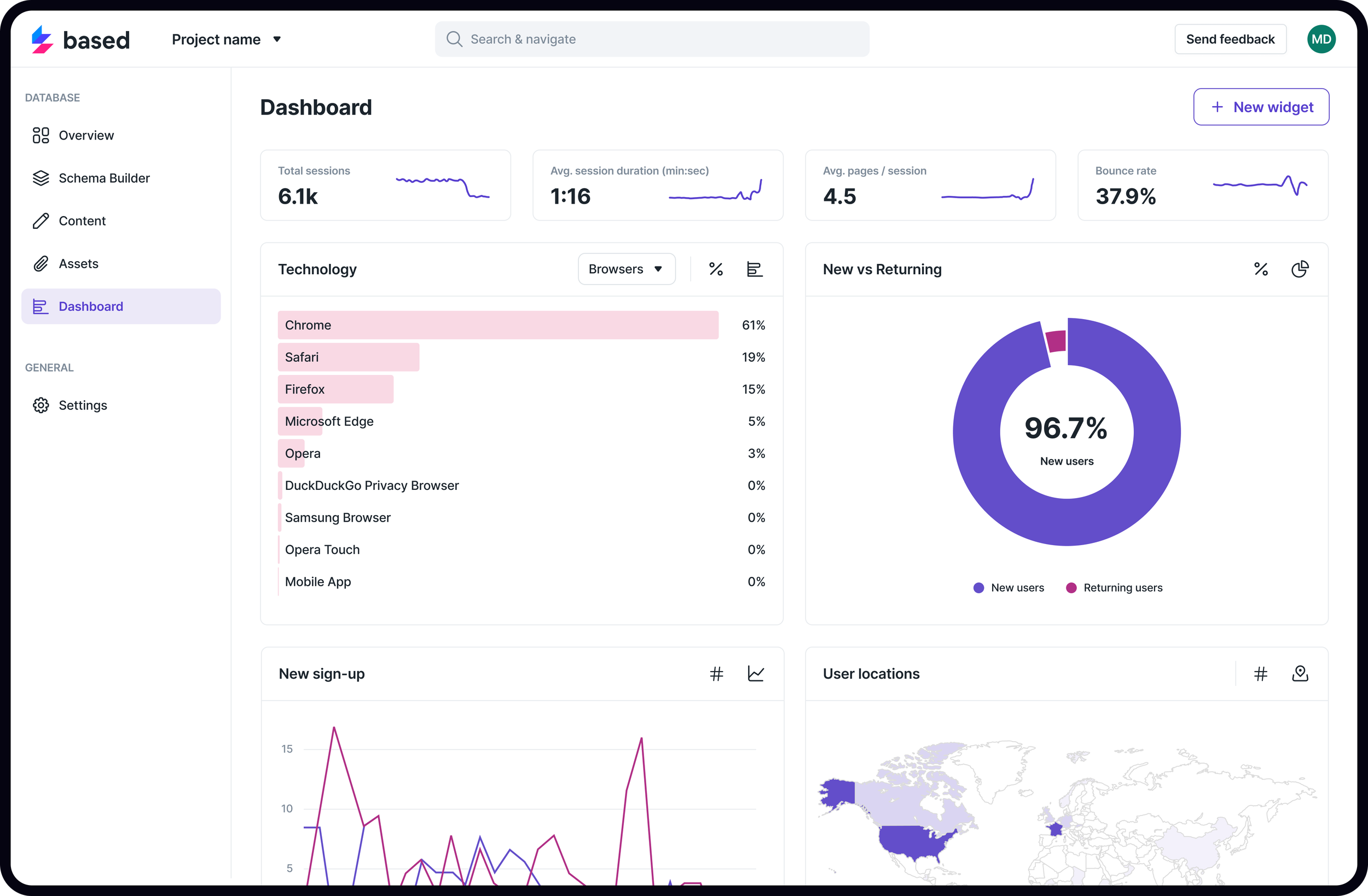
Light mode
-
![]()
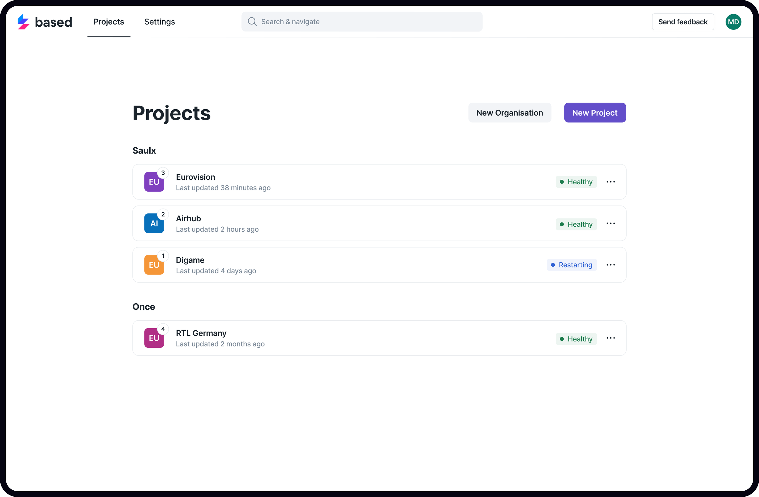
Project Overview
-
![]()
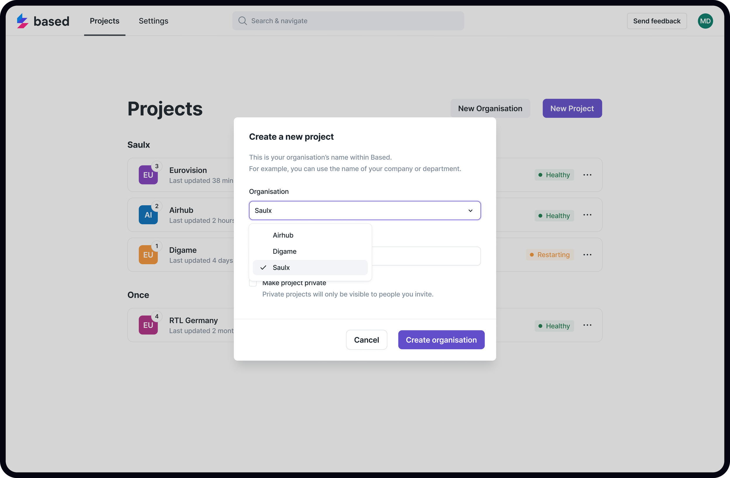
Modal Example
-
![]()
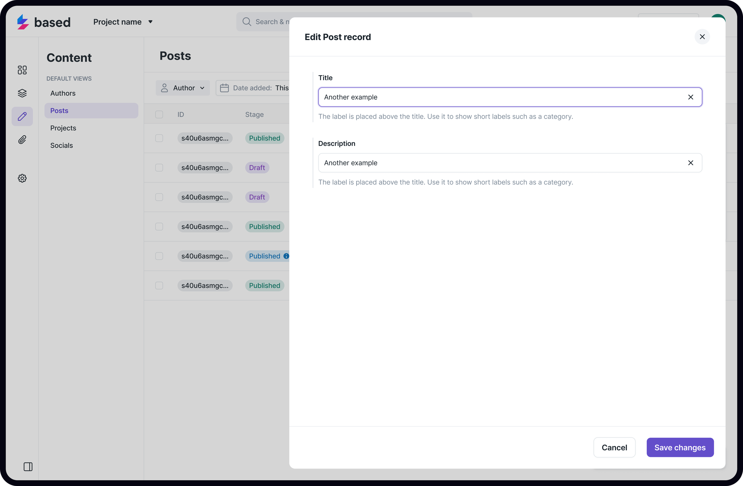
Content Editor
-
![]()
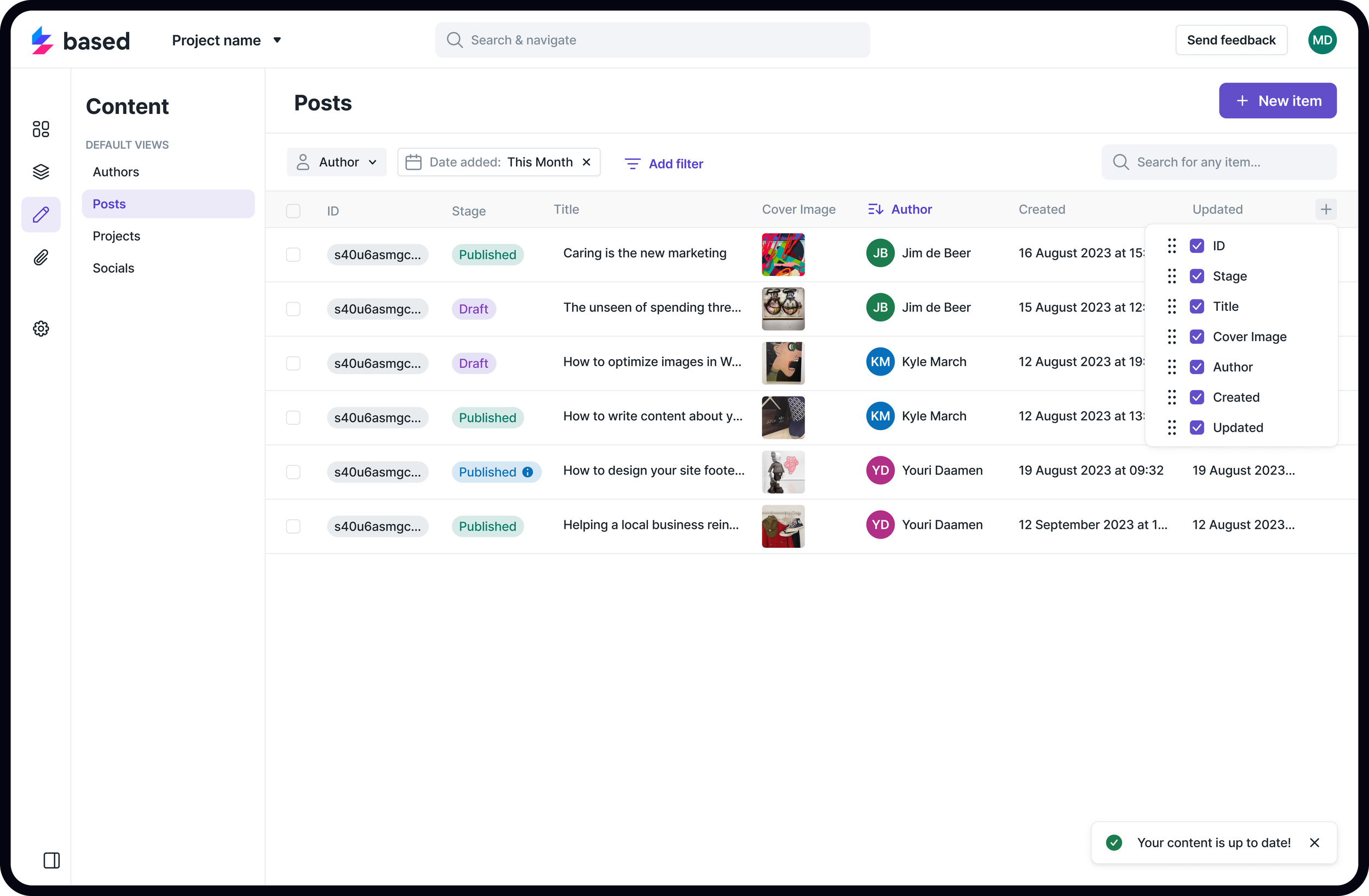
Editable Table
-
![]()
Logging and Stats
-
![]()
Analytics